My Layout in Roz Willoughby's Silhouette Journal
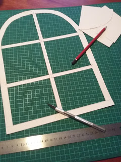
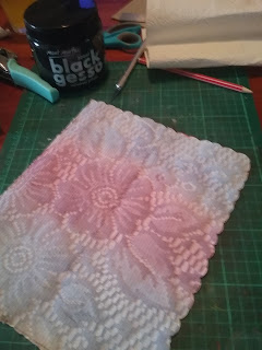
One of my favourite themes is the silhouette and I finally had the chance to work in Roz Willoughby's silhouette themed journal. The pages were quite large compared to what I normally work in but I found it rather freeing, imagination wise, to try to fit something large onto the page. After having a good think I decided to put a few smaller shaped silhouettes into the layout and making them integrated by using a window frame. I sketched the shape of the window, cut it out of some photocopy paper and this was the start of my layout. I then copied the frame on to pages, length wise and to add a bit of interest around the outside of the frame, I ended up doing some stamping with a script stamp all the way around the edge. I then proceeded to add colour to the inside parts of the windows. The top section I wanted a full moon, night time scene so I used black and whire to get a haized effect. The middle set of windows I used shades of blue to create an ocean, water type of s...